On Friday 1st December I presented my three mock ups for an artists tour poster, CD cover and Billboard. The rational for my designs are aimed at females aged 16-30 because they are suitable for them ages, this is because its not got anything inappropriate for anyone under the age of 18, but also its not too young for 30 year olds to enjoy. Because the colours are very neutral it makes it more easier for a larger target audience to enjoy it and like it. The target audience is mostly aimed at females because its more if a girly band and not many males would enjoy the poster and also the artist it relates too. However males could enjoy this design because its not got loads of bright colours like pinks and purples so more males could like it because of the colour scheme not being aimed completely at a female audience.
Rational: My target audience would like this design because its quirky and different to just having a photo of the artist on the front cover, this way it makes some people question who it is but also if someone fits in the target audience then they will know who the artist. Its also perfect for the target audience because the songs on the album would link to the artist and the style really well, people who enjoy this sort of music and style enjoy this layout and understand everything to do with the artist.
Rational: My target audience would like this design because its quirky and different to just having a photo of the artist on the front cover, this way it makes some people question who it is but also if someone fits in the target audience then they will know who the artist. Its also perfect for the target audience because the songs on the album would link to the artist and the style really well, people who enjoy this sort of music and style enjoy this layout and understand everything to do with the artist.
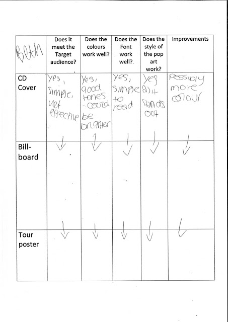
Key feed back from my classmates about meeting my target audience is that it's too specific about who it relates to because of the fonts, they also said it relates to my target audience really well. Someone else said yes and the minimalism works well for a wide target audience. All of my classmates said my designs meet the target audience really well as its simple and effective. Which makes it well for a wide target audience.
For my final designs i would want to change the colours and most of the feed back was saying how it could be brighter and many change the colour of the font to make it have more colour which links to the face. Another feed back was that i could maybe have the back of the CD cover so it can have some more information about the CD. Another idea of feed back was that i could maybe add something else which makes it more like a CD cover or a tour poster.
What the feedback said about what people liked the most is the blank space directs peoples instantly look towards the eyes as they are the brightest thing on the poster. They also said the font is very clear and modern. Another classmates feedback said how they like how the font is really easy to read as its clear and bold.They like the pop art style to it. Someone else mentioned how they like the way the font is a use of hierarchy and that all designs are similar as they are easy to know they are by the same artist.


Comments
Post a Comment